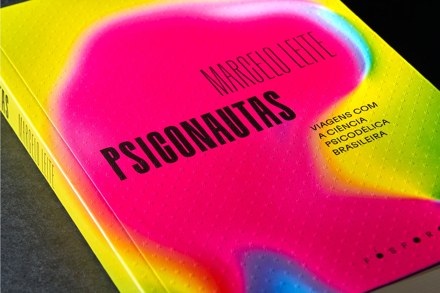
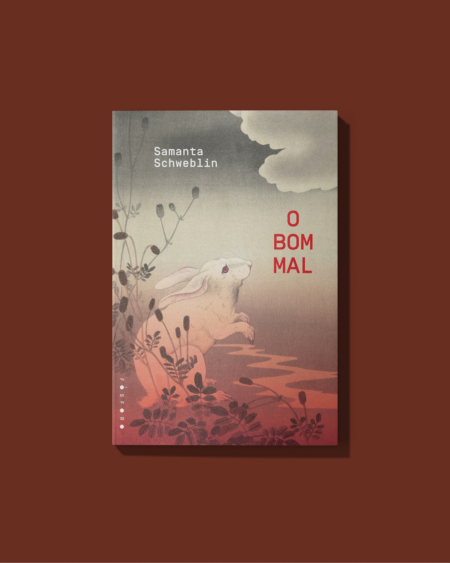
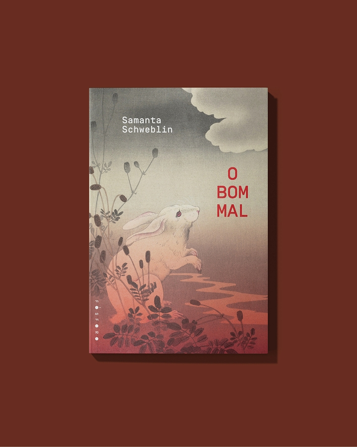
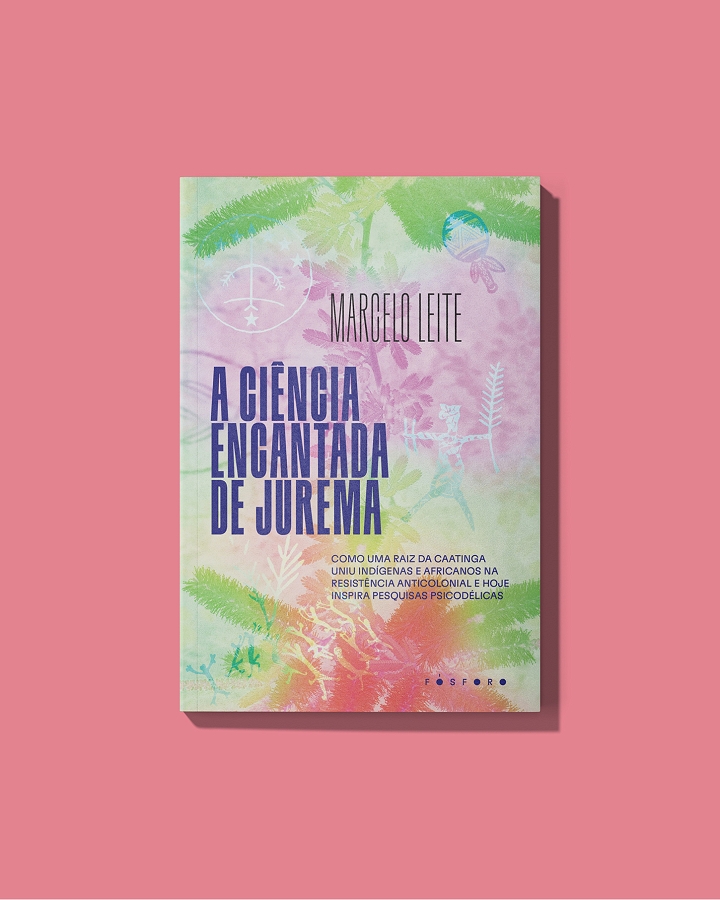
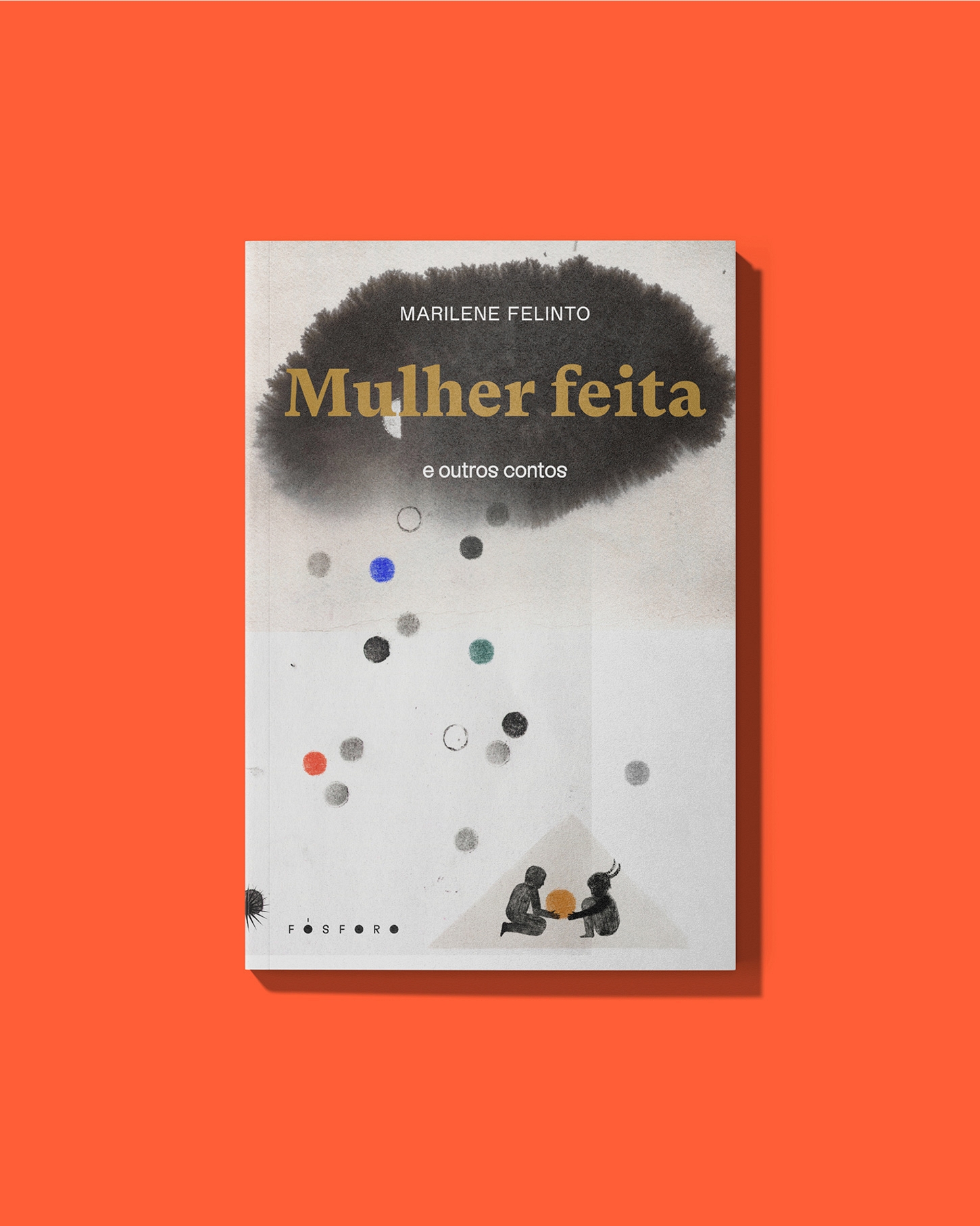
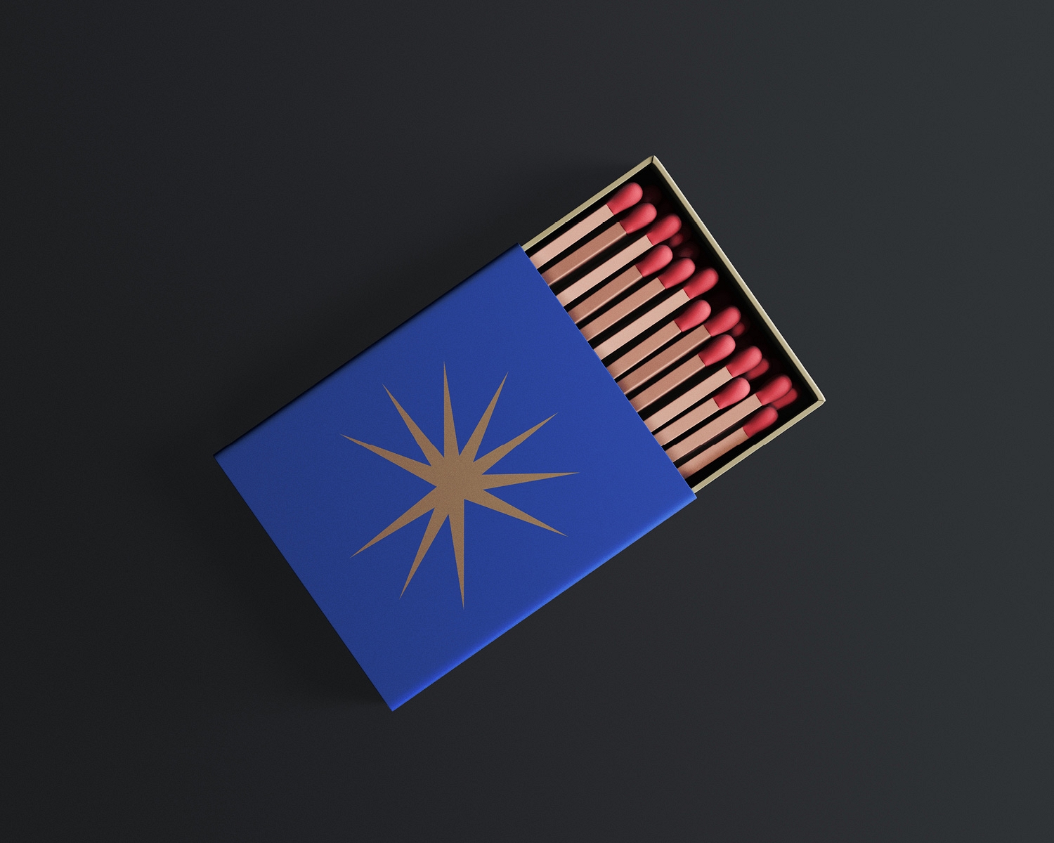
Fósforo was born as an heir to Três Estrelas, maintaining a direct relationship with its symbolic universe. The name comes from the chemical element - phosphorus as a spark, combustion, the principle of light - and continues the idea of stars, now re-signified as forms in transit. The brand operates between the graphic and the organic, between movement and the static.
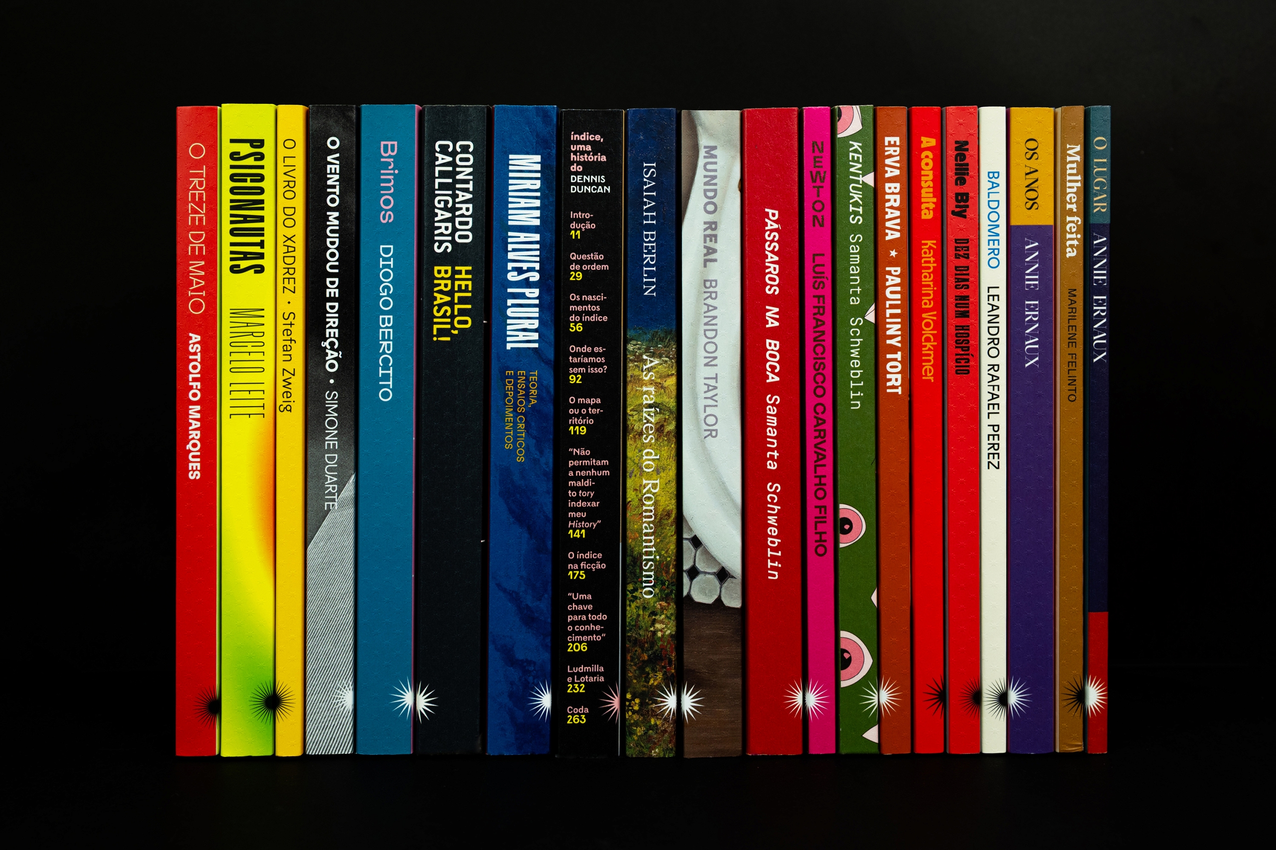
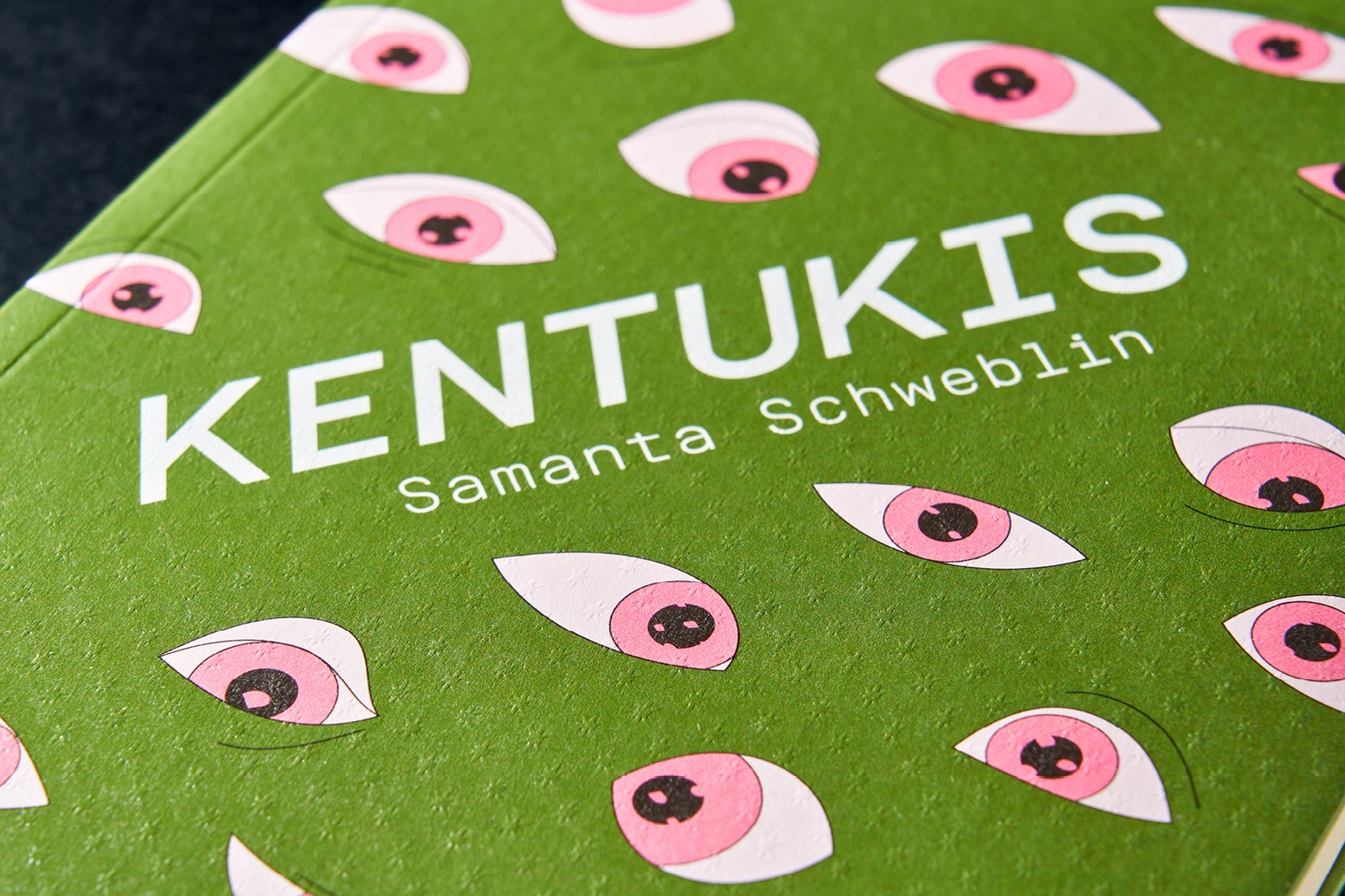
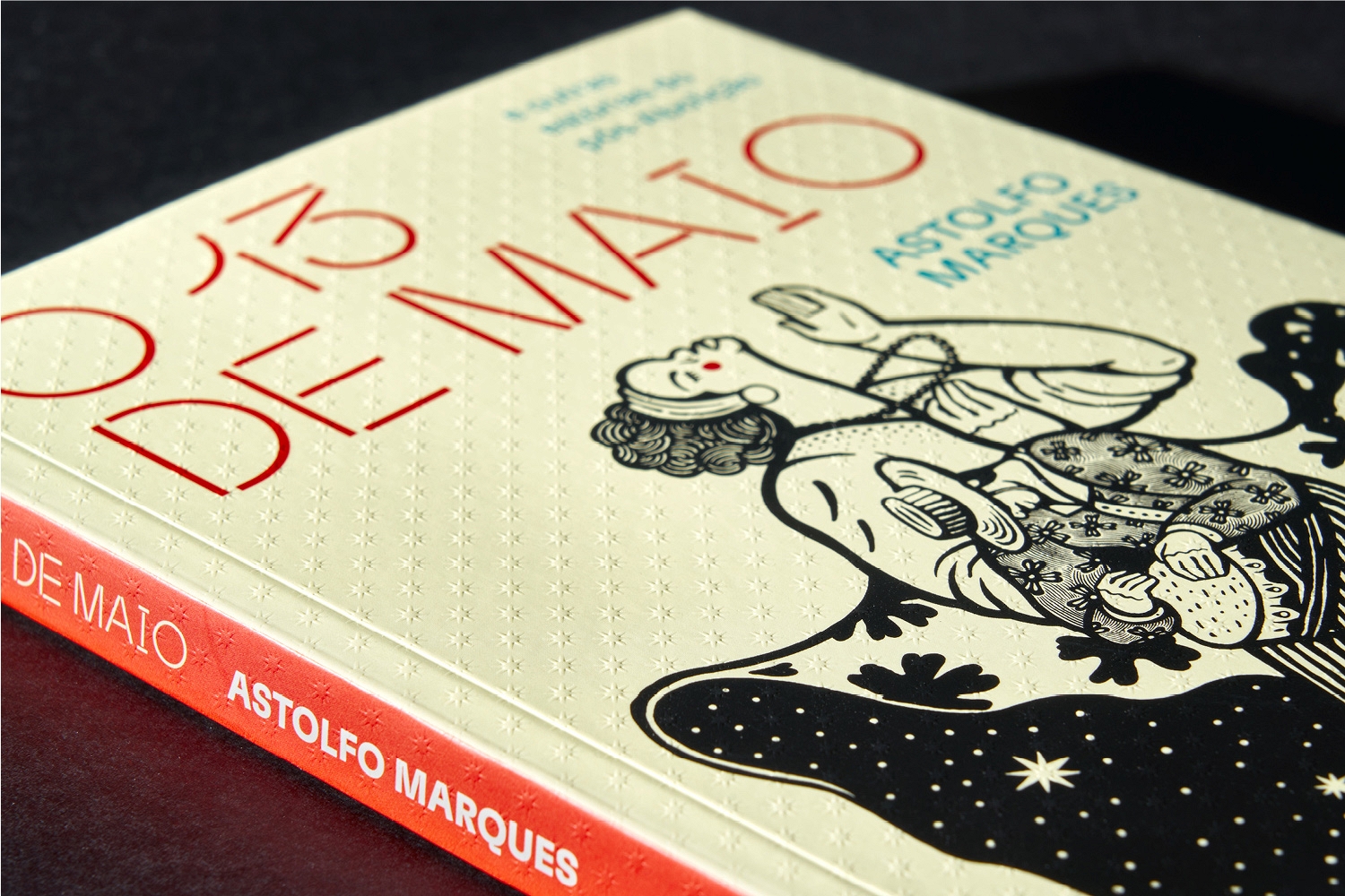
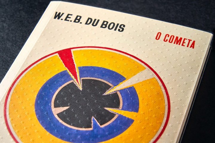
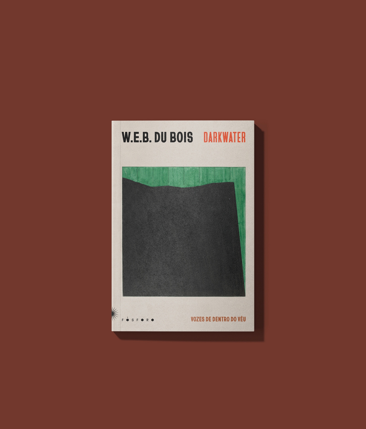
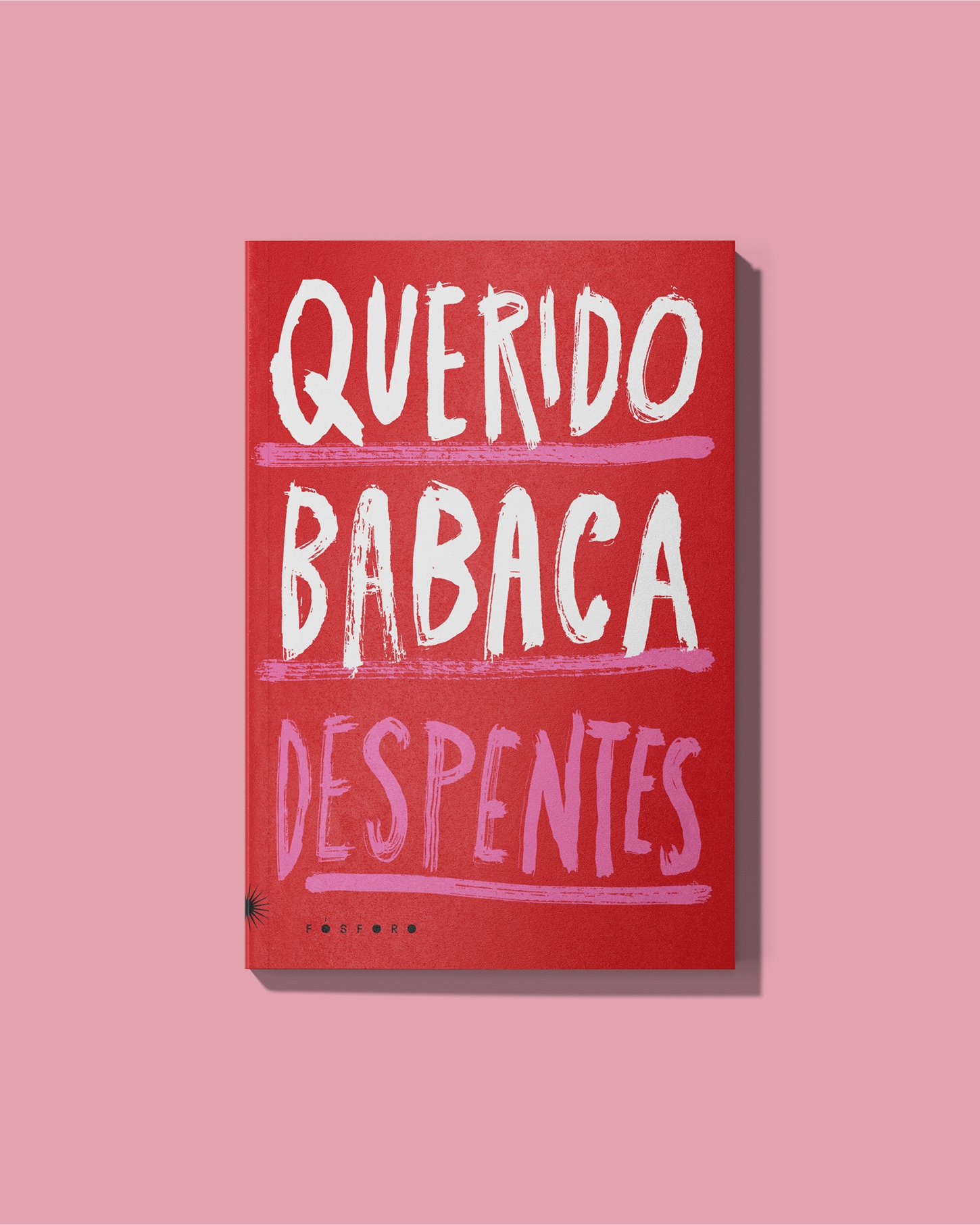
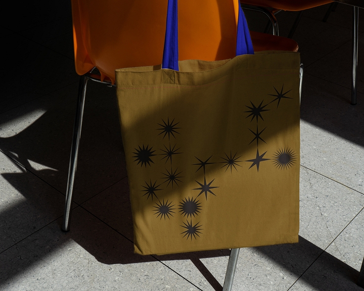
The visual identity is made up of a set of shapeless, unstable stars with no fixed points. Each variation is based on the same logic, but adapts to the medium: covers, prints, editorial applications. On the spine, the star is deliberately moved to the edge, allowing the books to graphically align themselves by the position of the symbol. The gesture reinforces movement and acts as a recurring visual mark, while escaping centralization. The system explores contrasts - sobriety and exuberance, regularity and dispersion - while maintaining cohesion in the variation.
In addition to defining the name and visual identity, the studio developed the publisher's website and structured the graphic designs for the cover and core, creating a flexible editorial system to support different collections and formats.