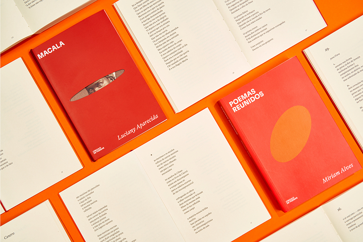
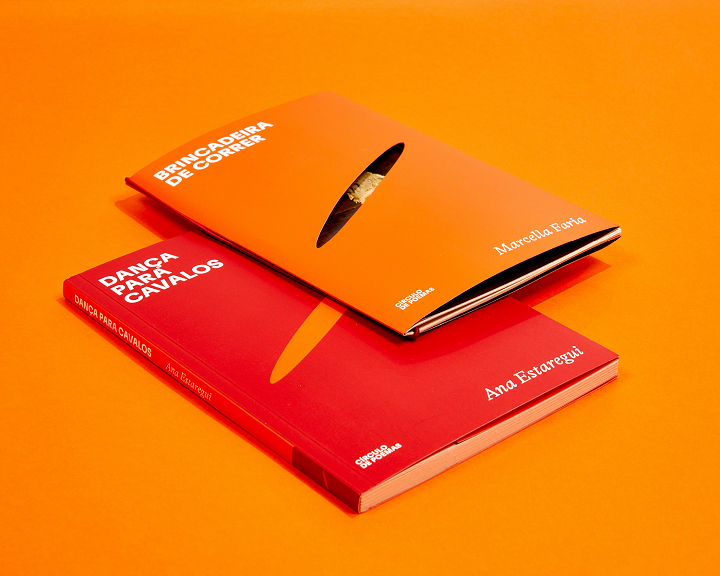
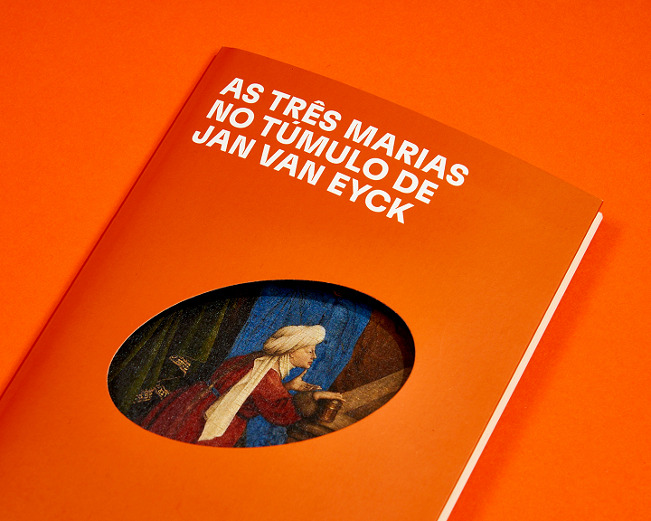
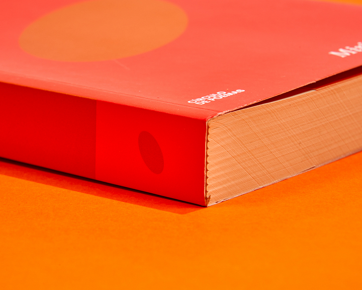
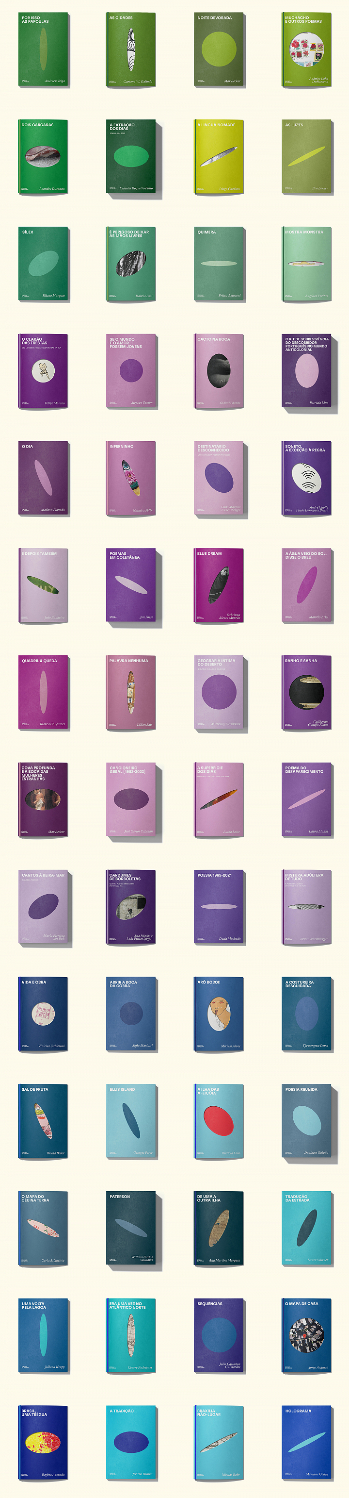
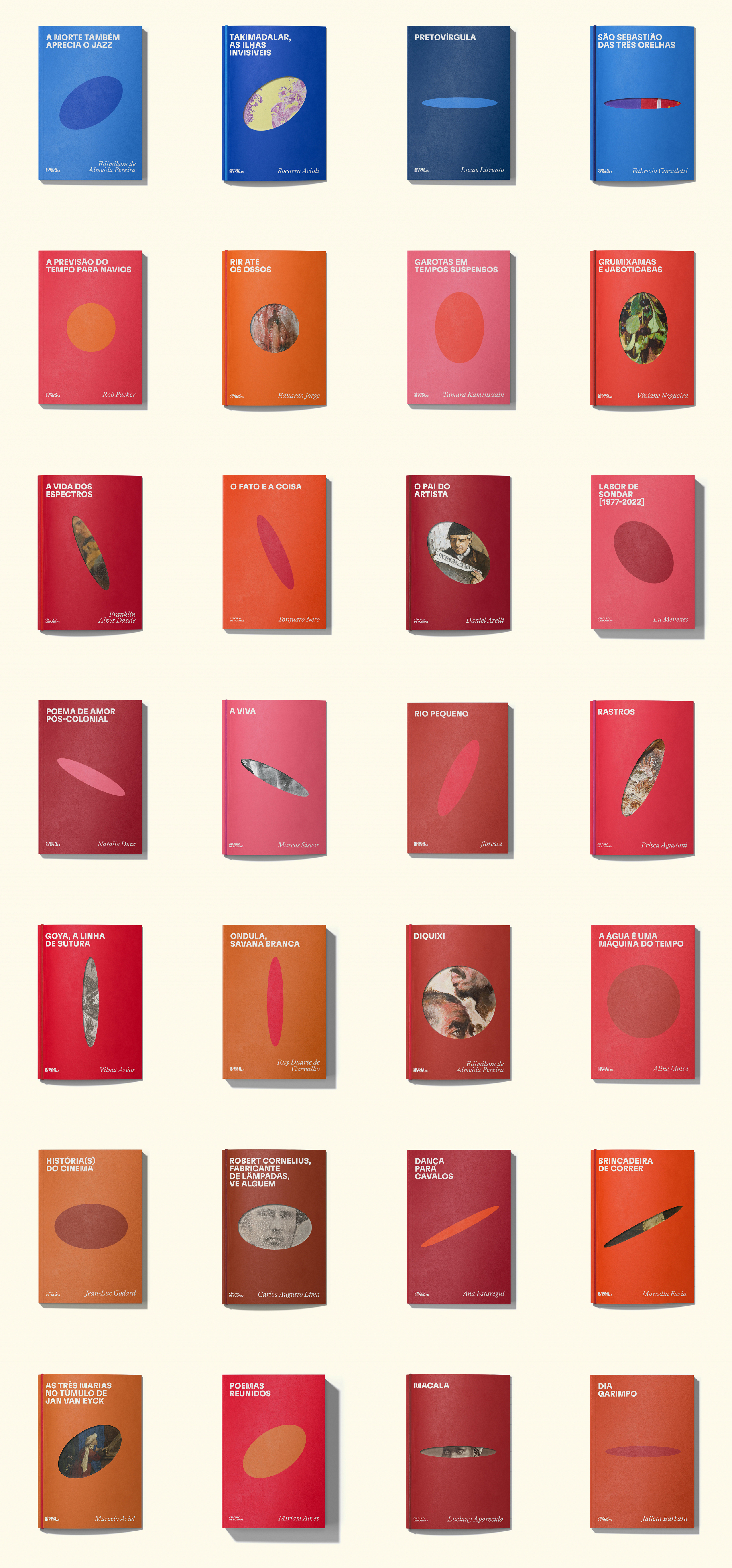
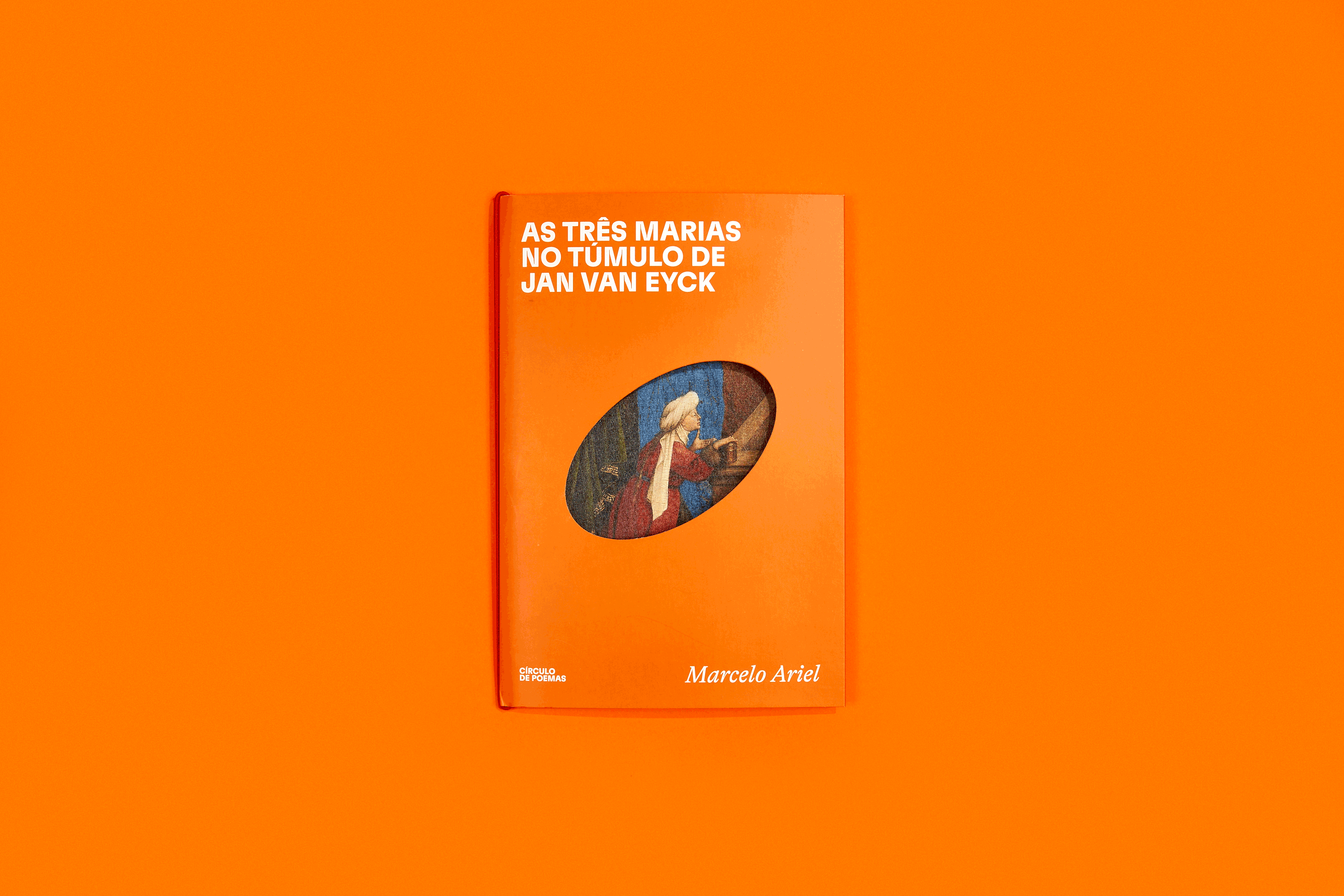
Círculo de Poemas was born as an imprint of Editora Fósforo, structured around a continuous and modular graphic system. The visual identity is organized around twelve circles with different distortions - shapes derived from universal mathematical proportions, which build variations within the same matrix.
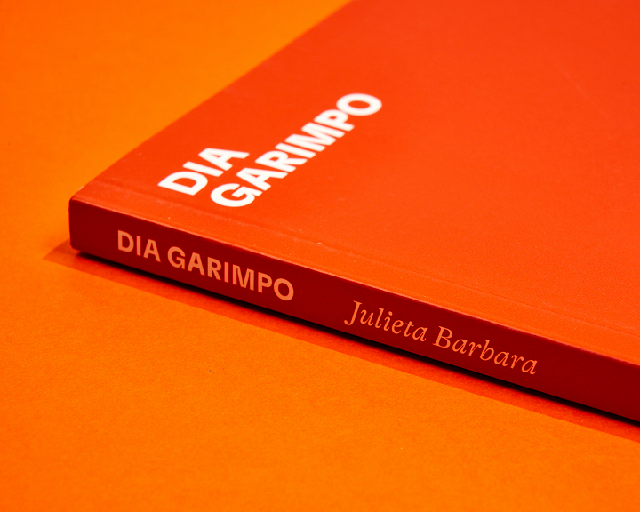
The project adopts an annual chromatic logic: for each publishing year, a color family is chosen (reds, greens, blues, pinks, browns). Each book combines two shades from that year's palette, creating subtle variations within the same chromatic atmosphere.
The covers maintain a fixed structure: typography, graphic elements and overall composition remain constant. The color duo and the shape of the central circle - cut from specific graphic knives - vary with each new publication. The circular window on the cover acts as a visual and tactile unifying element, allowing the volumes to fit together and be differentiated.
The bookplates follow the same graphic principle: they use one of the colors of the corresponding book and maintain the central window system. On the back of each plate, a visual work is incorporated, expanding the dialog between poetry and image.